JEN GUZMÁN
CREATIVE DIRECTOR

We loved letting the ingredients and product breathe on this fresh linen backdrop.

This variation on of the linen option centralizes and neutralizes everything onto a concrete backdrop. The headline sites on an orange rectangle.

The turquoise green background naturally activates the golden tones found in both the ingredients and the products.

This richer variation is inspired by smoke, fire and spices.
Key Visuals exploring headlines, hierarchy and balance between the two brands and their cocktails.

Header card shown with both brands.
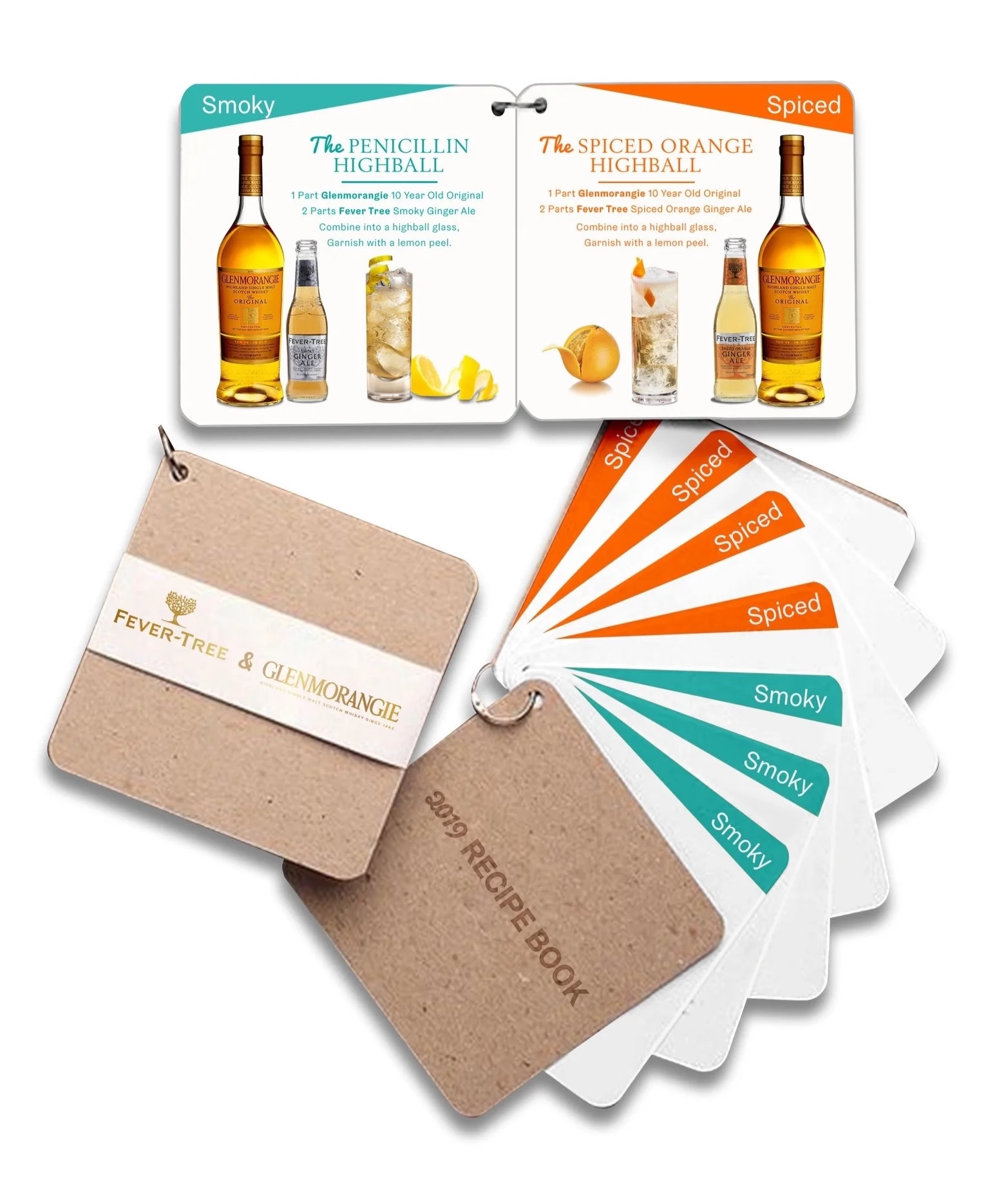
Recipe Cards.

Smaller and larger footprint displays, depending on the retail landscape. The first one is a semi-perm display made out of wood. The second one dresses up the case card with a floor decal, cardboard palm trees and case sleeve, and a complimentary glass. The third one is inspired by the world-wide origins of the ingredients found in Fever Tree, thus a suitcase. The suitcase can be with a real one, making it a dealer loader, or the same effect can e be achieved using cardboard to save in budget.